A Design System isn't just a project. It's a product serving products.
Problem
In 2021, several design-related issues were identified affecting consistency, user experience, and implementation:
A Design System is more than just a UI kit or component library. It is a comprehensive set of guidelines, standards, and principles, accompanied by toolkits of UI patterns, code snippets, and components.
Benefits
Process
Discovered powerful global design systems including Material, Human Interface Guidelines, Atlassian, and Carbon.
Defined the core principles that guide the Condor Design System.
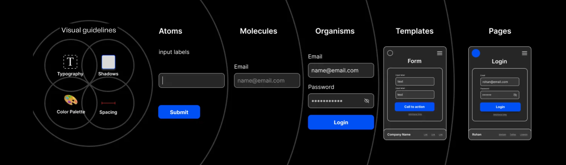
Structured the system using Brad Frost's Atomic Design Methodology with hierarchical organization: Visual guidelines — Atoms — Molecules — Organisms — Templates — Pages.
Principles
Uniformity in design elements ensuring trust and familiarity across all touchpoints.
Reusable components saving time and costs for both design and development teams.
Adaptable to company growth and new products as the business expands.
A shared language between designers and developers that bridges the gap between design and code.
Foundation
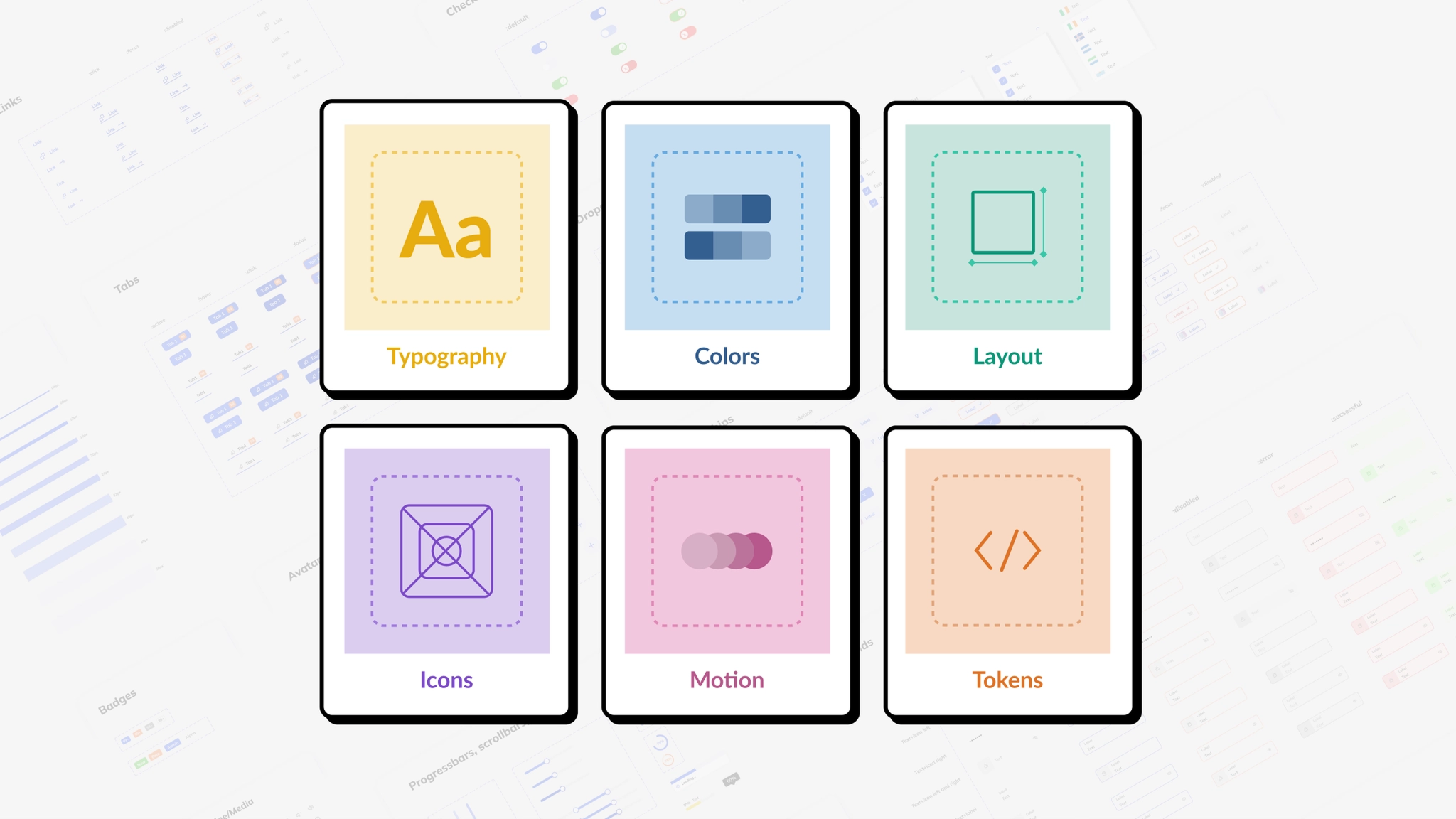
The foundational visual elements that define the Condor Design System:
Reflects brand identity with primary, secondary, and accent colors specified in RGB/HEX values.
Typefaces, font sizes, line heights, letter spacing, and hierarchy guidelines for consistent text treatment.
Consistent layouts across screen sizes with defined spacing and alignment rules.
Style, size, and alignment specifications with a standardized icon library.
Photography styles, image treatments, and illustration techniques that align with the brand.
Components
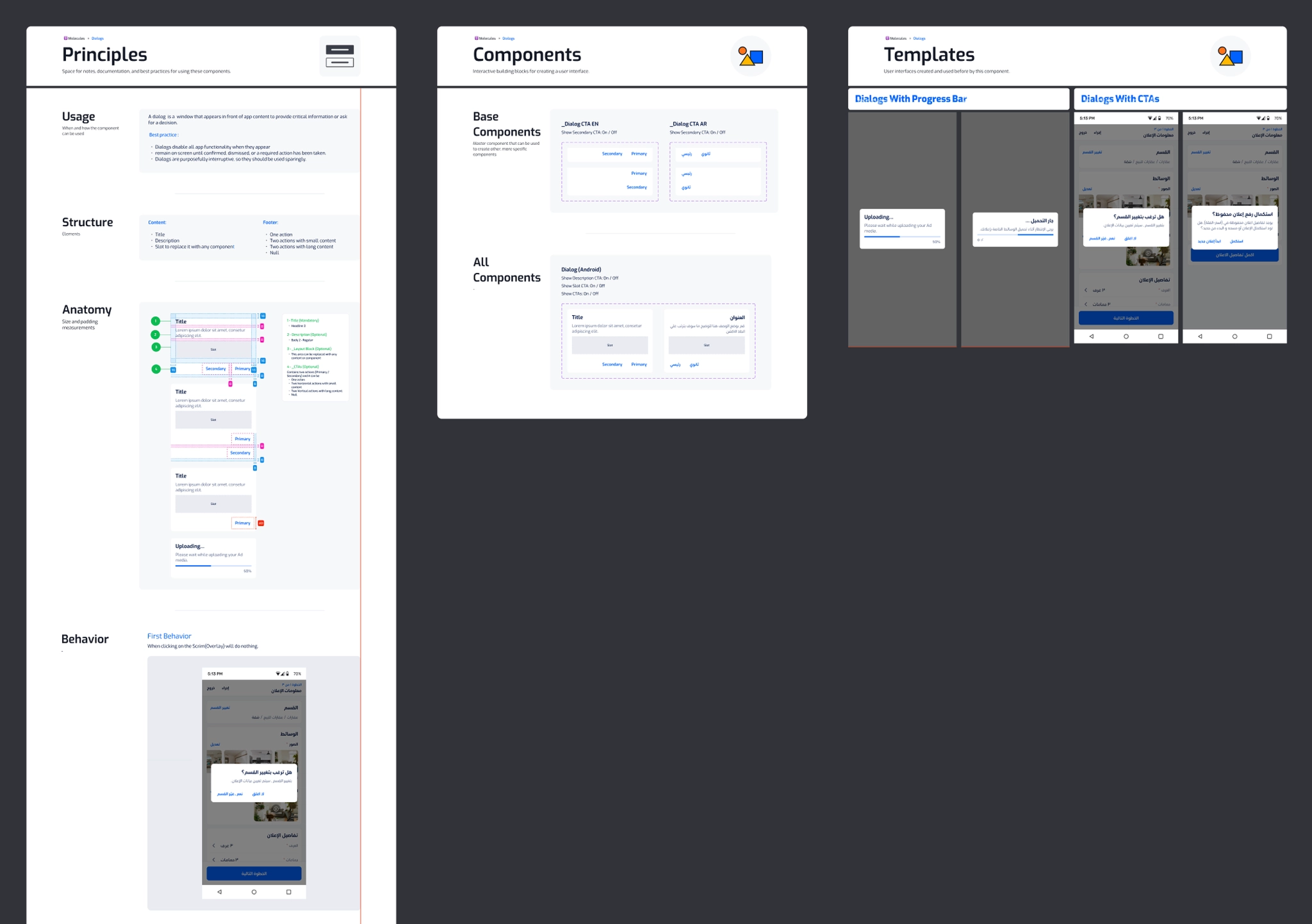
UI components play a crucial role in a design system as they are the building blocks for creating consistent and reusable user interfaces across different platforms.
Each component follows a rigorous building process:
Study best practices and existing patterns across established design systems.
Catalog component variations, states, and usage requirements.
Prepare detailed specifications for development implementation.
Validate component implementation against design specifications.
Release components to the library and continuously iterate based on feedback.
Evolution
Design systems must evolve based on user needs and expectations. Condor will evolve over two years as the team learns more about:
Cultural context is critical — designers must understand cultural norms and traditions of target audiences to create meaningful, effective designs.
Next Steps
Team
Design Lead, Senior Product Designer, Product Designer
Web Lead, iOS Lead, Android Developer
Design System Advocate